The second of our Photoscape tutorials involves taking a macro image from the Fujifilm Finepix AV150.
Again the aim here is to improve the general look of the image by cropping and refining it. By way of reference I have included a finished version of the image using Photoshop CS5, kindly done by my son. This finished version gives us a benchmark to work to by way of comparison.
As you can see from the original image its appears somewhat washed out and the overall exposure looks to be a little underdone.
The first item is to crop out the part of the image that really isn't of any value, this helps to isolate the subject and focus of the image.
Leaving us with a much better perspective of the item of interest.
The next step is to change the light values slightly to better suit the image. As you can see from the image below, Gamma has been reduced, contrast increased, and the overall "Tone" of the image has been changed by increasing the depth of color to 35 on the deepen slider. To select these options click on the Bright,Color button.
Now that we have reduced the washed out look somewhat its time to refine the image. The aim here is to create the look of glass that is evident in the water droplets of the spider web. The Gorse that the web is woven on will become a lot less defined to start with as we progress through the next few steps.
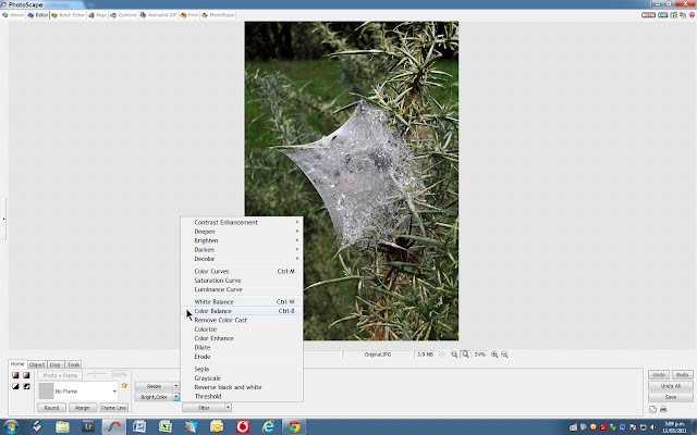
We now want to "cool off" the tone of the image as we move more towards the ice and glass look on the spiderweb. Select "Color Balance" from the Color,Bright Button and then apply a small set of adjustments as shown to drop away some of the color and contrast in the background while improving tone and contrast in the spider web.
You can see from the two images above that a small adjustment has changed the look of the image and the spiderweb now looks a lot more transparent and glassy. This is the look that we want to maintain.
Next we need to introduce more contrast into the image to gain a greater separation of color boundaries and overall tone. Selecting from the Bright,Color toggle we will select a medium contrast enhancement as shown. Too strong a contrast change will make balancing the final colors more difficult.
As we now have the required look for the spiderweb its time to bring some of the background color back. This is done by selecting the color curves sub-menu of the Bright,Color button.
Uncheck the "Green" curve and select the midpoint of the curves line, click and drag as shown until the natural color is obtained, in this case the greens of the background and the gorse plant. The natural colors have now been brought back as they would be if viewed at the scene of the photograph.
Now that the background color has been attended to the image still seems a little muted. Rather than change the overall brightness to the image a small amount of backlight will be added. Note that when selecting the sub-menus from the backlight button there are two types of backlight. One deals with foreground and the other is used to lift background highlights. The latter will be applied here as the foreground has already had the required treatment applied.
Note that a +50% setting has been used to lift the background of the image without changing the overall brightness.
This process will be followed by a medium sharpen as we dont want the final image to appear overcooked from excessive sharpening. A value of 7 has been selected from the Sharpen button sub-menu.
After sharpening the final process is to reduce the noise in the image. The noise in this image from the AV150 is quite well controlled so a medium value was used as shown just to reduce some of the midrange color and luminance noise.
Having applied the noise filter the only thing required is to save the final image. And thats it, your all done.
Below is a comparison of three edits of the same image, from left to right they are an auto level using Photoscape, The final edit from this tutorial using Photoscape (center) and the right hand image is the Photoshop CS5 final.
My observations are that the auto level is too warm and the Photoshop image a little too cool, but has good transparency on the spiderweb. The final edit from our tutorial file is in my opinion a better balance of color and transparency. The slightly whiter spider web in the tutorial image is more accurate as well. Editing of course is very subject and what appeals to me may not appeal to you. Have a play and see how you get on. The first image in this second tutorial is the original so just click through for the larger images and have a go. Have fun.
Full sized final image after editing in Photoscape.
Original crop |
Finished Photoscape edit. |


Love these tutorials!
ReplyDeleteCheers Casey, I'm happy you have got something from them.
ReplyDeleteHi Mr McKenzie. great tutorial-
ReplyDeletecongrats to you and thumbs up to photoscape!! yay yay
Have a nice day
Thank-you, and don't forget to check out the latest tutorial as well
Deletehttp://akiwiretrospective.blogspot.co.nz/2012/04/fine-tune-your-images-using-photoscape.html